
Phoenix Public Library.
Website Redesign
Tools:
Figma
Adobe Photoshop
Research partners:
Shannon Boesch, Catherine Baldwin, and Stephanie Becerra.
Photo and content credits: https://www.phoenixpubliclibrary.org/ , https://www.phoenix.gov/library, James A. Molnar on Unsplash, Aksapix Studio
Context:
This project was a class-assigned case study to evaluate and improve the usability of the Phoenix Public Library website over the course of three months.
The Problem:
How do we create a more intuitive browsing experience for library-goers?
Research
Methods:
Heuristic Evaluation
User Interviews
Card Sorting
Usability Testing
Problems:
Based on heuristic evaluation, user interviews, and site testing, the following usability issues were found:
book
Finding materials
Users had a hard time navigating the website to browse for books or find the availability of items. This is problematic because it is one of the most used features of the library website.
list
Organization of information
Some parts of the website were difficult to find for users due to organization issues.
eye
Visual inconsistencies
Changing header styles on different parts of the website confused users when trying to navigate to a new page. An inconsistent design language and a cluttered appearance hindered the scanning process and slowed users in completing tasks.
Brand Design
Before creating the final prototypes of the redesigned Phoenix Public Library website, the branding had to be defined. Colors, fonts, buttons, and element styles were reevaluated to hone in on the existing brand identity of the library and create a more streamlined experience for the user.

Wireframing
Wireframe sketches were used to ideate user flow and plan the placement of content and features.

Design Solution

Home Page
Before:

Problems : The wide variety of colors and buttons creates difficulty for the user to decide where to focus. The search bar does not function as expected - instead of browsing the catalog it browses the website.
After:

Navigation + Browsing
Navigation is simplified based on an open card sort by 5 different users.
The browsing feature is highlighted at the top of the page as the primary action.
Popular Pages feature for quick navigation.

Spotlight
A spotlight feature is present to highlight big events, updates, or news that the library would like to share.

Upcoming Events
"Upcoming Events" give the user a sneak peek as to what programs and events the library offers.
Featured Programs + Footer
Highlight popular programs.
Footer design was rearranged based on open card sort data.

Locations & Hours
Before:
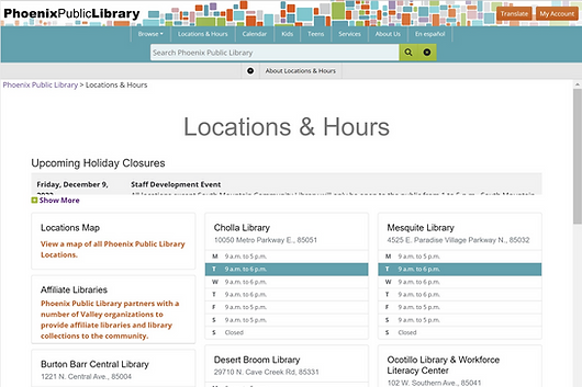
Problems : Confusing sorting orientation, and too much information is presented to the user at once.
After:
Locations & Hours
Links are more visible and less cluttered.
Different options to sort by location.
Map on desktop version to visualize locations.
Only current day hours are displayed on this page.

Search Catalog
Before:

Problems : The current icons did not make sense to users during testing. A different header on the page creates confusion as to where user is on the site.
After:
Site Header
Header and branding matches rest of site.
“Search Catalog” title added.


Catalog Organization
Most relevant options are shown first on the page.
Audiobook, physical copy and e-book options are all under the same title listing.
Written out text is used instead of icons for better understanding of less commonly used terms.


